Transforming Adelaide Airport: Comprehensive Branding and Design Solutions
Welcome to the Adelaide Airport Rebranding project. This comprehensive rebranding initiative was undertaken to modernize and elevate Adelaide Airport’s visual identity, ensuring a cohesive and impactful brand presence.
Project Overview
As part of my role at a leading design agency, I had the privilege of contributing to the Adelaide Airport rebranding project from its inception. Adelaide Airport, a key hub in South Australia, required a refreshed visual identity that reflected its commitment to innovation, customer experience, and regional pride.
Design Process
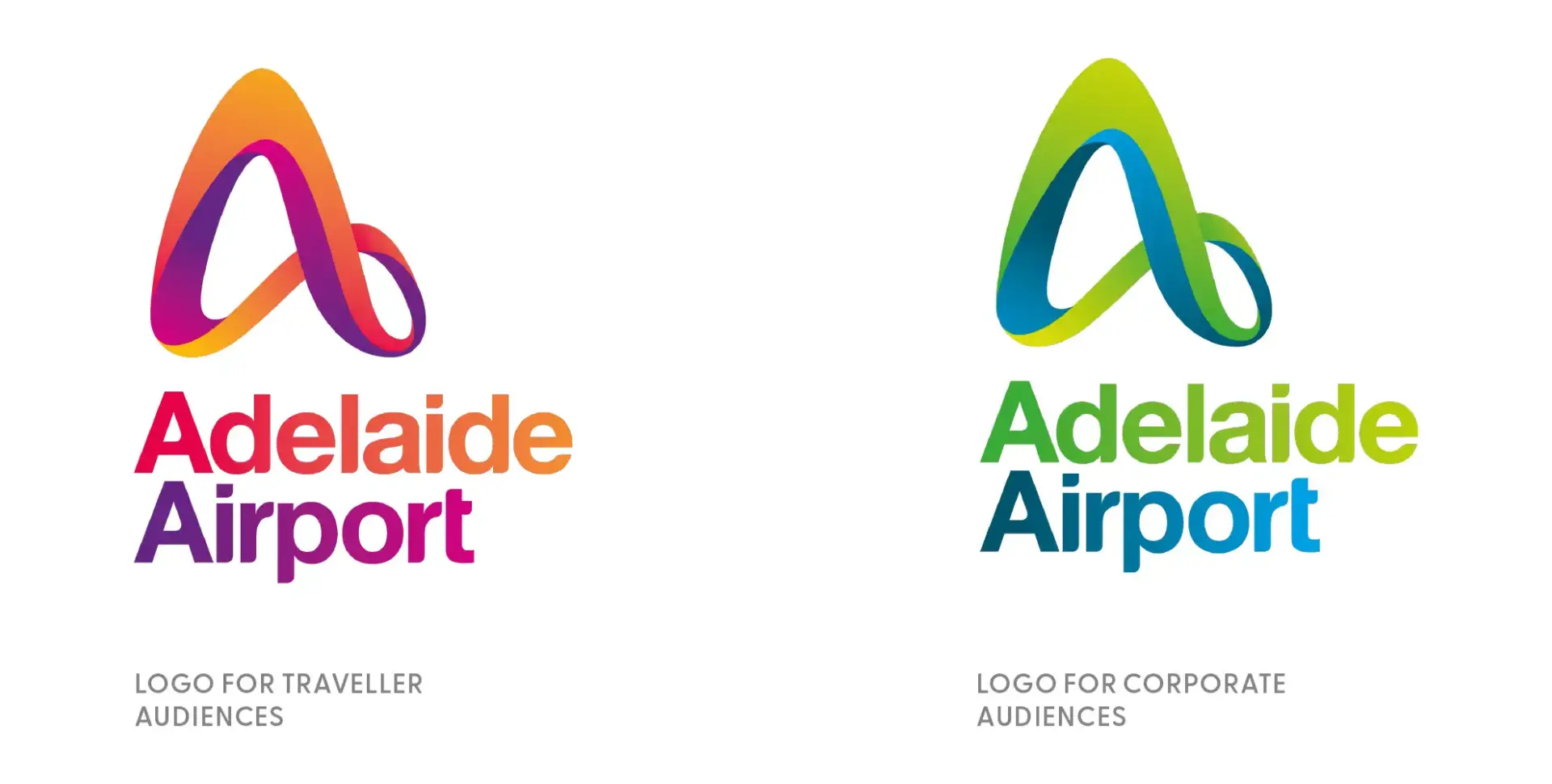
The project began with the creation of a new logo that embodied Adelaide Airport’s modern and dynamic spirit. Following this, I was involved in the extensive rollout of the brand across various touchpoints. This included designing marketing materials, environmental graphics, signage, and digital assets to ensure a consistent and engaging brand experience for travelers and staff alike.
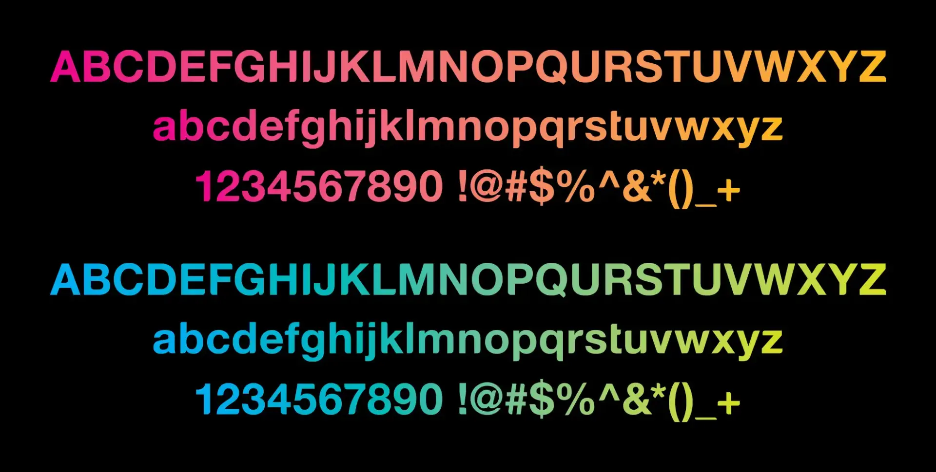
Adelaide Airport custom designed font - AIRVETICA
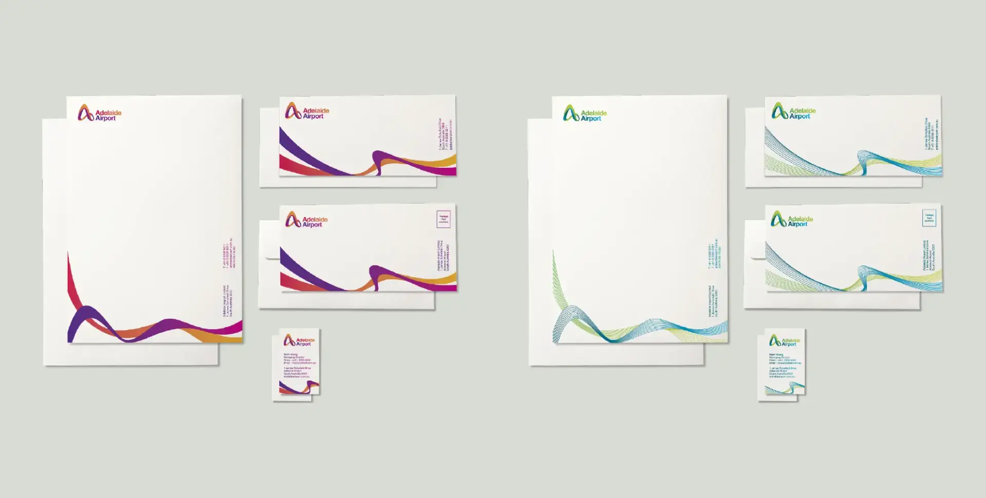
Stationery design set for traveller and corporate audience
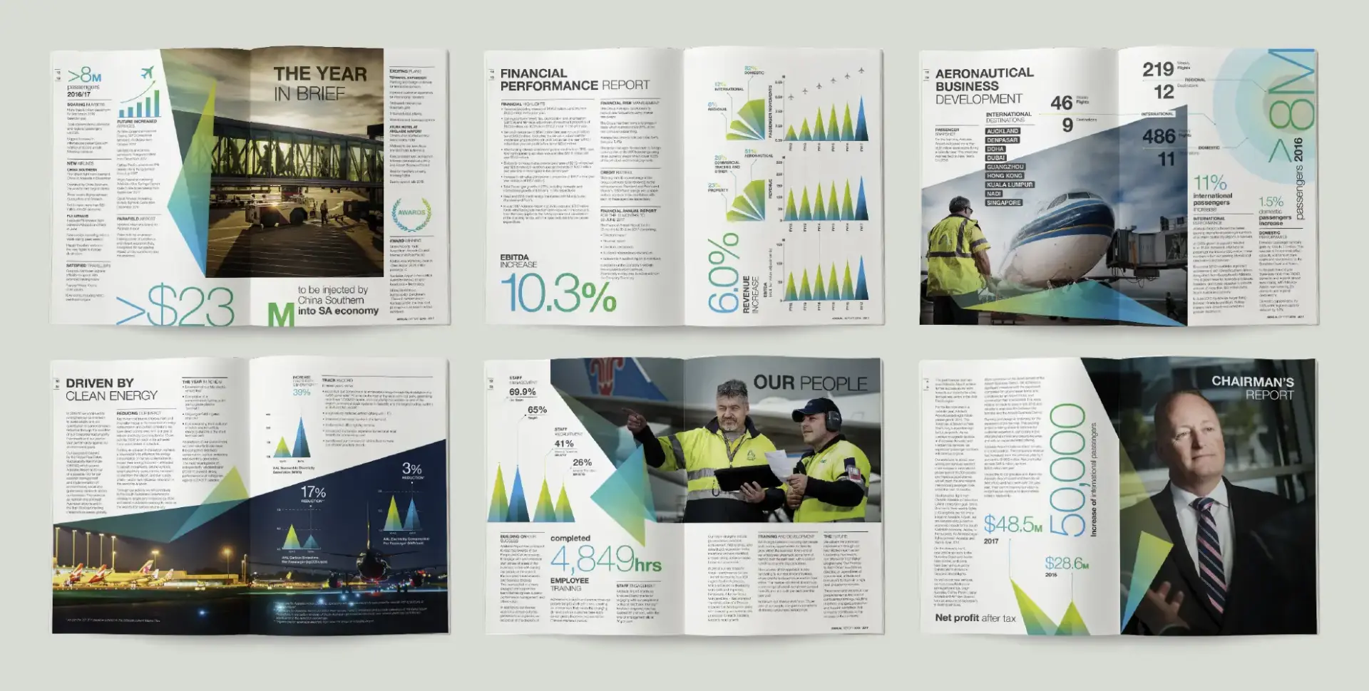
Annual report design incorporating layout styling, infographic and photography styling
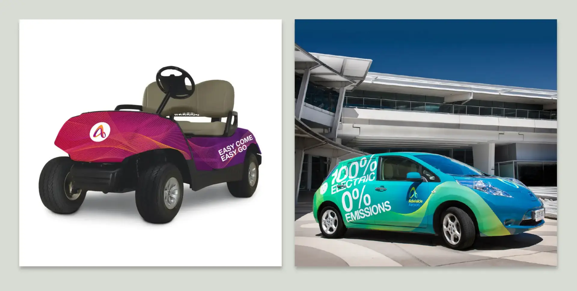
Car decal design for traveller and corporate audience
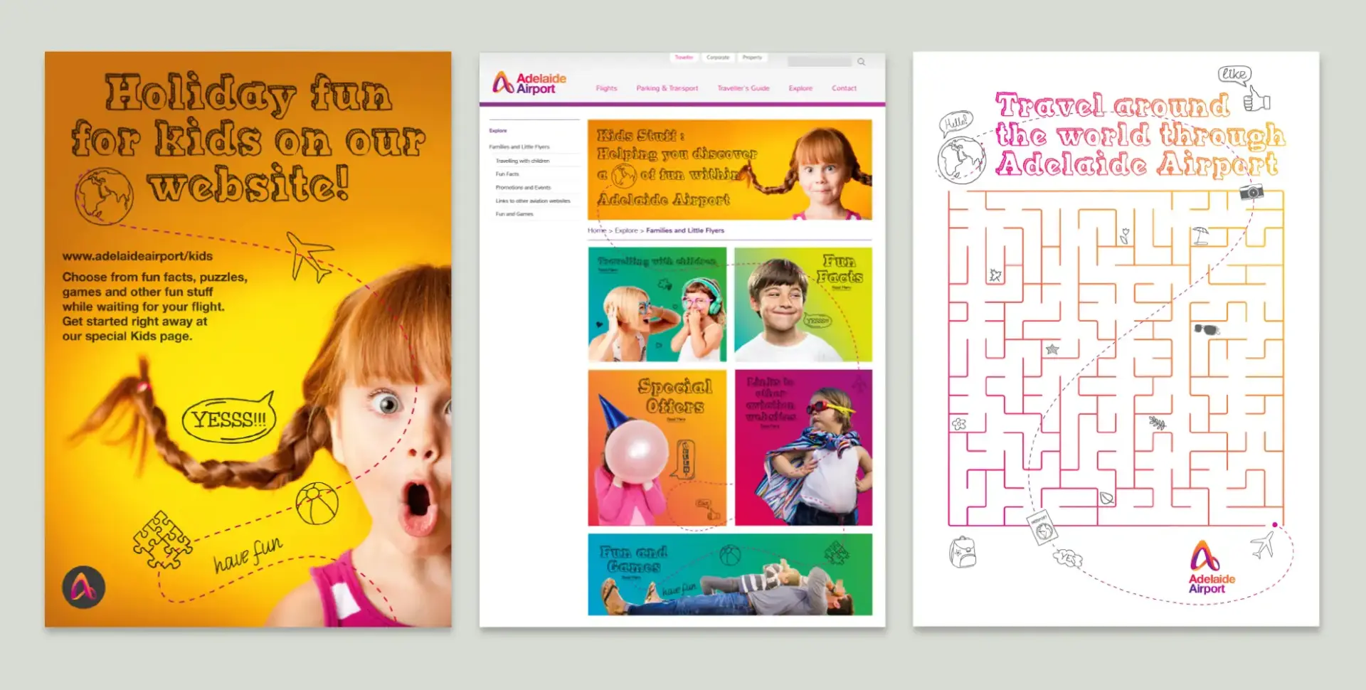
Little Flyer, the kids section at Adelaide Airport

Newspaper ads for OzAsia Festival in 2016
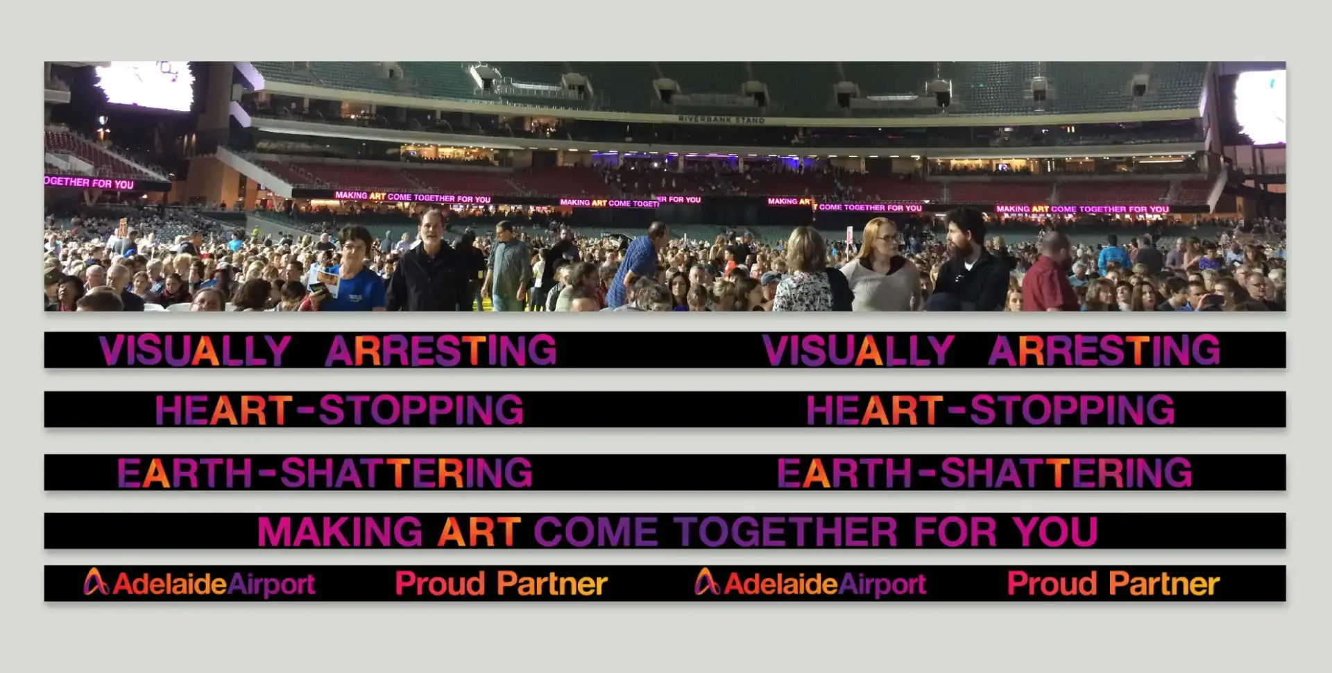
OzAsia Festival text animation
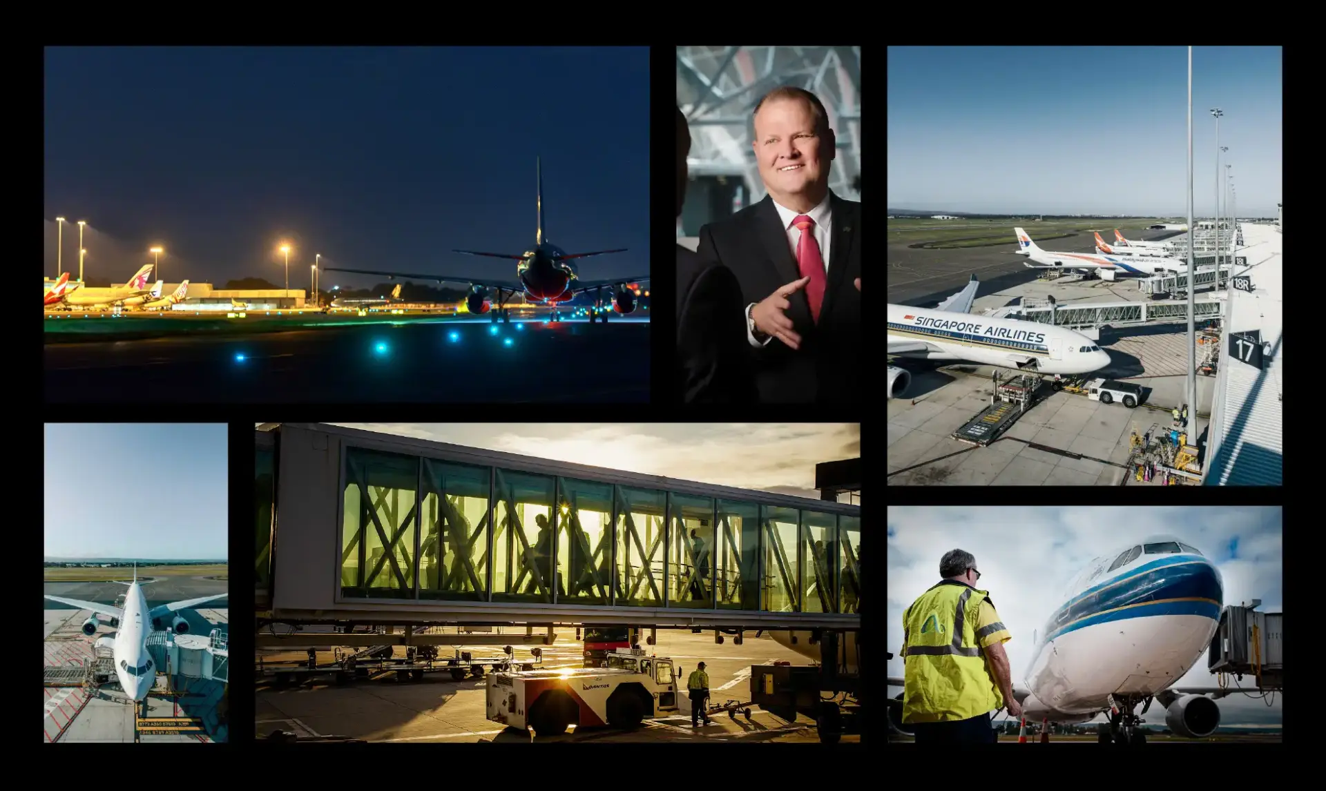
Adelaide Airport Photography Styling
Key Elements
We developed a modern and dynamic logo representing Adelaide Airport’s vision and values, designed brochures, flyers, and print materials to communicate effectively with diverse audiences, and created engaging wayfinding signage to enhance the traveler’s experience within the airport. Additionally, we crafted consistent and captivating graphics for the airport’s website and social media channels, ensuring a seamless online presence. The project also involved branding for airport vehicles, visuals for advertising campaigns, and materials for internal communications such as quarterly published newsletters and annual reports. Furthermore, we provided photography styling and art direction to ensure a cohesive visual narrative across all platforms.
Impact
Over the six-year span of the project, the new visual language significantly improved Adelaide Airport’s brand visibility and coherence. The rebranding has successfully positioned the airport as a forward-thinking and customer-centric destination, enhancing its reputation locally and internationally.
Explore how strategic design and creative solutions have transformed Adelaide Airport’s visual identity. Ready to elevate your brand? Contact me today to discuss how we can achieve remarkable results together.
Agency: Nicknack – A Strategic Branding Agency
Creative Director: Nick Price
Copywriter: Peter Rufus

